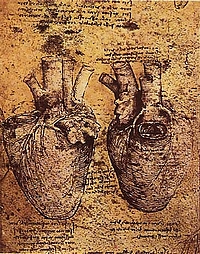
Oh Writer! With what words will you describe the entire configuration with the perfection that the illustration here gives?
— Leonardo Da Vinci [1]

That was said by Leonardo da Vinci, when he wanted to record the complexity of the human heart.[1] He wanted to present the notion that sometimes the images are the best form to transmit reality, even as until that time it was rare for images to be used to educate the reader, to study the subject or to present an idea. The Written Word was often perceived as holy substance and the image was considered to be a lower form of expression. Something that was used to present the Words with a beautiful form and nothing more.
A lot of time has passed since and the status of images has risen greatly. Yet still they are often not seen as equal partners of the text, but as mere illustrations to catch the eye. They may be thought to be less accurate. Even when the rise of visual communication has made them indispensable in so many fields, not much attention is given to their informative value. We could say than when the ability to read and write, that is literacy, is seen as hugely important for every person and lot has been done (and will hopefully be done in the future) to increase the literacy rates around the world, then almost no attention has been given to visual communication.

Let me make an example. When the second modern census was carried out in Estonia in 1897, it was concluded that over 91% of people living in that territory could read and 77.7% could write. By 1934, the percentage of people who could read and write was already 96.1%. A lot of time has since flown by and for many decades it has been considered as one of the countries with the highest literacy rates in the world with an impressive 99.8%. But have we ever asked how good we are with our visual literacy? And what about the other countries?
This isn’t just about self expression, but about unlocking the true human potential. And when we think about the Wikipedia, are we the ones bringing the changes about or the ones in desperate need of them? Why it is so much about the text and so little about the media content, that the latter fails to hold our attention. But just as Leonardo da Vinci, one of the greatest geniuses ever lived, came to an understanding that some concepts can only be presented via images, so that they could be easily conceivable, then is it so much of a different story with the modern day encyclopedia? I think not.
When we consider all the well written texts to be highly accurate and easily understandable, then we fail to recognizance that even legislation, what has been scrutinized and approved by the best and brightest minds can rarely be described as uniformly understandable and applicable. If the Text will bring out details, then it is the Image, what has mastered the depiction of the whole. It is the combination of the two, what really represents the maximal power of expression. Wikipedia needs the media files to present the world in all of its complexity! Images, videos, audio files, diagrams etc.

This blog-post has been inspired by the European Science Photo Competition (ESPC) that took place in Wikipedia. As when we come to science, the forefront of human accomplishment, then isn’t it there, where we need the combination of images and text to really show our present understanding of the world. And it’s there, where the capturing of the light allows us to make new discoveries in the first place and extend that knowledge we are so keen to share.
If science has the grand task of finding out what is not yet known to man, then the capabilities to document the world via images has had a great part in it. Will it be a thousandth of a thousandth of a second, that we could capture, or a set of two images taken 100 years apart in time (why don’t we use more rephotography in wiki?). Camera may allow us to peek into other wavelengths and investigate things far too dim or small for a bare eye.
Development in imaging technology has made it possible for us to see what has never been seen before, and yet still, even though human ingenuity has no limits, we often limit our chances for expression and make so little effort to present what has been seen. We do gravely talk about the content gaps with articles, but not so much abut the images on them. And what kind of tools do we have to really show the media we have collected?
Just look at these videos down below that were submitted to ESPC from Estonia, and think how would you have described that with text what you can see there. And yet, there are so few videos in Wikipedia.
- Cytoplasmic streaming in onion bulb scale epidermis cells by Heiti Paves. [video]
- Caenorhabditis elegans worms by Heiti Paves. [video]
- Briggs–Rauscher reaction by Maxim Bilovitskiy. [video]
- Barking dog reaction by Maxim Bilovitskiy. [video]
- Daphnia magna swimming in slow motion by Lennart Lennuk. [video]
- Small gallium droplets fusing together by Tavo Romann. [video]
Plenty of questions can be asked. Not just like “how to obtain the highest quality images there are?”, but “how should the images look like so that they could depict the topic in a most characteristic and neutral form” or “could there be additional ways to present media content in Wikipedia articles”. Just like the fact, that there is an article about topic x, makes that topic to look more important, then that same sensation of importance is even more amplified with images. To build a great encyclopedia we must both look for great images and think how to use them. And it must not escape from our attention, that there are another forms of media as well, that should be brought to Wikipedia.
Maybe this free online encyclopedia is not yet complete and there is still a lot of work do be done? Specially for the visual part of it.
A well-known Estonian entomologist and nature photographer Urmas Tartes likes to say that a good picture broadens the horizons of human understanding. He defines the perfect photo as something what combines knowledge with emotion and what is presented in a most suitable environment. Could Wikipedia become that medium, what is suited best for showing images like that? Are we up for the challenge ahead?
Ivo Kruusamägi, organizer of European Science Photo Competition and a long time administrator of Estonian Wikipedia.
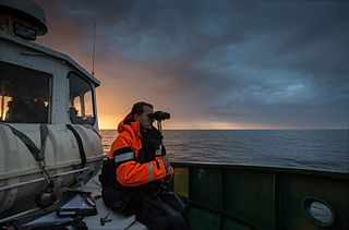
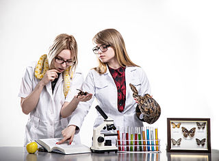
Copyright notice: drawing of Leonardo da Vinci is in public domain due to the age, image by Mati Kose is licensed under CC BY-SA 3.0 and the image about biologists has CC BY-SA 4.0 as a licence. Videos are all under CC BY-SA 4.0.
P.S: Next science competition will take place in 2017 as a worldwide event.
[1] Sherwin B. Nuland. Leonardo da Vinci: A Life. Penguin, 2005. ISBN 9781440679278.